Tools of the Trade: How Spawn’s Experts Get Things Done
Website Planning Tools
Who I Am: Michael Johnston, Senior Digital Producer
What I Do: As the digital producer at Spawn, I’m the one who makes our team’s fantastic creative ideas—for online ads, websites, or fun interactive projects—into working (read: launched/live/clickable) digital assets for our clients.
I actually use a lot of different tools, but for this post we’ll focus on a couple that I employ for creating sitemaps and wireframes when we’re planning a website.
What Are Sitemaps and Wireframes?
You can’t build a new website without creating the sitemap and wireframes first. These are key deliverables, because they show you everything that will be on the website, and where it will live.
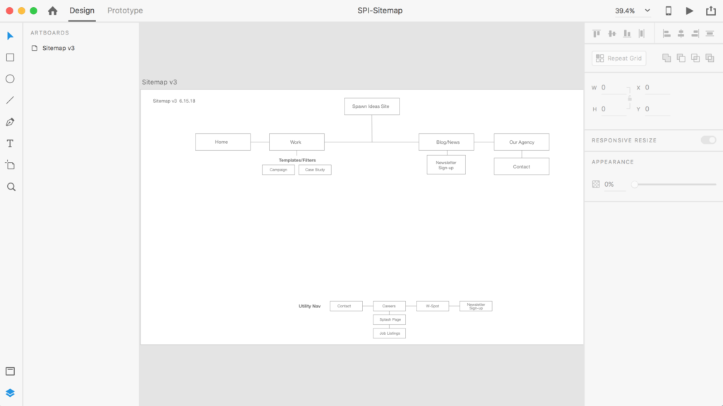
A sitemap is a list of all the site’s pages, organized by where they’ll live in the site’s hierarchy (usually that means the site’s navigation).
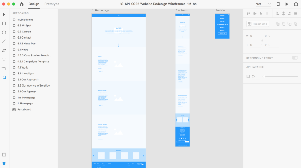
 The wireframes show the skeleton the site’s pages. They’re like construction blueprints, with boxes indicating what will be on the page, and how important each element is. Designers then use these to create a look and feel that’s functional and beautiful.

The Tools I Use
Adobe XD
As we were rebuilding Spawn’s website (the one you’re reading right now!), I used Adobe XD.
It’s a relatively new tool from Adobe, one that was created for designers, by designers. I’ve found it to be the fastest and easiest way for designing wireframes and sitemaps, and sharing them with clients.
Adobe XD offers a lot of flexibility on look-and-feel, and you can use it for websites or mobile apps. And bonus—it’s free.
Adobe XD Pros and Cons
What I like:
- Clean user interface
- How easy it is to add sample content
- The design flexibility
- Repeat grid is an awesome feature, allowing me to show multiple pages with the same layout
- Prototyping is amazing and very easy to accomplish for mobile and desktop projects
What I Don’t:
- Animating the UI is difficult compared to other tools, like Axure
- Some familiar Adobe key commands don’t work yet
- Design tool is limited compared to Illustrator or Photoshop
Axure
Another tool I’ve used quite a lot for wireframing and sitemaps is Axure. It’s been around a lot longer, so many web development teams and user experience designers are already familiar with it.
Axure Pros and Cons
What I like:
- Useful for creating rich user interface (UI) prototypes on the fly and high definition screens for mobile devices
- It’s easy to edit page elements
- You can make really detailed interaction prototypes
What I Don’t:
- The interface isn’t intuitive, so there’s a pretty steep learning curve
- Once you’ve set up a prototype, making tweaks to the interactive elements can be very difficult
- There are no keyboard shortcuts
- The software ends to crash often
- Its software feels and looks outdated
Though there are plusses and minuses for both of these tools, I’d recommend Adobe XD to a user experience designer or designer looking to create a sitemap and/or wireframes & prototype. If you’re looking to create rich animated UI prototypes, I’d recommend Axure.
Want to learn more about how we do digital work at Spawn? Send us a note to chat with one of our digital experts.


